
Selecting the perfect christmas ribbon colors to complement your existing ornaments can transform your holiday decorating from ordinary to extraordinary. The art of coordinating ribbon hues with your cherished ornament collection requires understanding color theory, visual balance, and the emotional impact of different seasonal palettes. Whether you have traditional red and gold baubles, elegant silver and blue decorations, or eclectic mixed collections, the right christmas ribbon choice will tie everything together harmoniously. Professional decorators understand that ribbon serves as both an accent and a unifying element, creating visual flow throughout your holiday display while enhancing the beauty of each individual ornament.
Understanding Color Harmony in Holiday Decorating
The Color Wheel Foundation for Christmas Decor
Color harmony begins with understanding the basic principles of the color wheel and how different hues interact with each other. When selecting christmas ribbon to complement your ornaments, consider whether your existing decorations follow a monochromatic, complementary, or analogous color scheme. Monochromatic schemes use various shades and tints of the same color family, creating sophisticated elegance. Complementary colors sit opposite each other on the color wheel, such as red and green or blue and orange, providing vibrant contrast that energizes your display.
Analogous color schemes use colors that sit next to each other on the wheel, like blue, blue-green, and green, creating peaceful, harmonious arrangements. Understanding these relationships helps you choose christmas ribbon that either enhances existing harmony or creates intentional, pleasing contrast. Temperature also plays a crucial role, with warm colors like reds, oranges, and yellows creating cozy, inviting atmospheres, while cool colors like blues, purples, and greens evoke calm, winter elegance.
Seasonal Psychology and Emotional Impact
The colors you choose for your christmas ribbon significantly impact the emotional atmosphere of your holiday space. Traditional reds evoke warmth, passion, and classic holiday nostalgia, making them perfect for families who cherish time-honored Christmas traditions. Gold and bronze ribbons add luxury and sophistication, elevating any ornament collection with their rich, metallic warmth. Silver and white create serene, winter wonderland effects that feel fresh and modern while maintaining timeless appeal.
Purple christmas ribbon introduces regal elegance and pairs beautifully with gold ornaments, while deep forest greens ground displays with natural, earthy sophistication. Understanding how colors affect mood helps you create the exact atmosphere you want, whether that's cozy family gatherings, elegant entertaining, or peaceful winter reflection. The psychological impact extends beyond immediate visual appeal, influencing how guests feel and remember their experience in your decorated space.
Analyzing Your Existing Ornament Collection
Cataloging Colors and Finishes
Before selecting new christmas ribbon, take inventory of your current ornament collection's dominant colors, accent hues, and surface finishes. Create a visual map by grouping ornaments by color family, noting whether you have predominantly warm tones, cool tones, or a balanced mix. Pay attention to finish types such as matte, glossy, metallic, or textured surfaces, as these characteristics influence how colors appear and interact under different lighting conditions.
Document any patterns, prints, or special details on your ornaments, such as glitter, beading, or painted designs. These elements provide opportunities for your christmas ribbon selection to either echo similar textures or provide smooth contrast. Consider photographing your collection under your actual holiday lighting to see true colors, as artificial lights can significantly alter how hues appear. This documentation becomes your reference guide for making informed ribbon choices that enhance rather than compete with your existing decorations.
Identifying Dominant and Accent Colors
Distinguish between dominant colors that appear most frequently in your collection and accent colors that provide highlights or special interest. Your christmas ribbon selection should typically complement the dominant colors while potentially echoing or contrasting with accent hues for added visual interest. If your collection features primarily red ornaments with gold accents, you might choose gold ribbon to emphasize the luxury elements or deep green ribbon to provide traditional contrast.
Consider the proportional balance of colors in your collection. If you have equal amounts of multiple colors, your christmas ribbon can serve as a unifying element that ties disparate hues together. Neutral ribbons like cream, champagne, or soft gray work excellently for collections with multiple strong colors. Alternatively, if one color dominates with small pops of others, your ribbon choice can either reinforce the dominant theme or strategically emphasize the accent colors for more balanced visual weight.
Traditional Color Combinations That Always Work
Classic Red and Green Partnerships
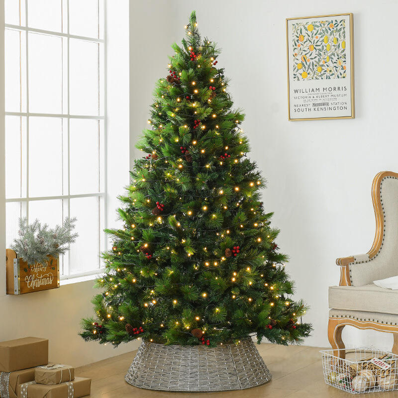
The timeless red and green combination remains popular because it creates perfect visual balance through complementary color relationships. When your ornaments feature traditional red baubles, choosing deep forest or emerald green christmas ribbon provides elegant contrast that feels both classic and sophisticated. This combination works particularly well when you vary the intensities, such as pairing bright red ornaments with deep, rich green ribbon, or soft burgundy decorations with sage green accents.
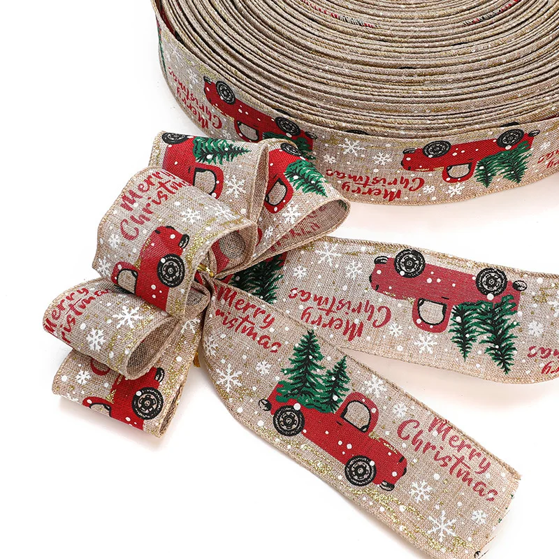
Consider texture variations within this classic palette to add depth and interest. Velvet christmas ribbon in deep red pairs beautifully with glossy green ornaments, while satin green ribbon complements matte red decorations. Plaid or tartan patterns that incorporate both colors can unify mixed ornament collections while adding traditional Scottish or English holiday charm. The key is maintaining proportion, ensuring neither color overwhelms the other in your overall display composition.
Elegant Metallics and Neutrals
Metallic color schemes offer sophisticated alternatives to traditional bright holiday colors, creating luxury hotel or high-end boutique aesthetics. Gold christmas ribbon pairs magnificently with bronze, copper, and champagne ornaments, creating warm, rich displays that feel expensive and refined. Silver ribbon complements platinum, pewter, and crystal ornaments for cool, winter elegance that photographs beautifully and works well in contemporary homes.
Neutral combinations provide versatility and longevity, allowing ornament collections to evolve over time without requiring complete ribbon replacement. Cream, ivory, and soft white christmas ribbon creates serene backdrops that allow ornament colors to shine while providing unifying elements. Burlap or linen-textured ribbons add rustic charm to farmhouse or country-style decorating themes. These neutral choices also photograph well for social media sharing and coordinate easily with existing home decor color schemes.
Contemporary and Non-Traditional Color Schemes
Monochromatic Winter Palettes
Modern holiday decorating embraces monochromatic color schemes that create sophisticated, design-forward displays. All-white christmas ribbon combinations with white, silver, and crystal ornaments produce stunning winter wonderland effects that feel fresh and contemporary. Varying textures within the white family, such as matte white ribbon with glossy white ornaments or textured white ribbon with smooth white decorations, prevents monotony while maintaining elegant cohesion.
Blue monochromatic schemes offer another striking contemporary option, using various shades from pale ice blue to deep navy. Choose christmas ribbon in complementary blue tones to create ombre effects or maintain consistent blue intensity throughout your display. This approach works particularly well in coastal homes or spaces decorated with blue and white color schemes year-round. Purple monochromatic displays create regal, luxurious atmospheres using lavender to deep plum ribbons with corresponding ornament shades.
Bold and Unexpected Color Combinations
Contemporary decorators increasingly experiment with unexpected color combinations that reflect personal style and modern design trends. Hot pink christmas ribbon with gold ornaments creates glamorous, fashion-forward displays perfect for urban lofts or contemporary homes. Turquoise and orange combinations bring tropical warmth to winter celebrations, particularly appealing in warm-climate locations where traditional winter imagery feels disconnected from the local environment.
Black and gold combinations offer dramatic sophistication, using black christmas ribbon to create striking contrast with metallic gold ornaments. This combination works especially well in modern or minimalist home designs where traditional holiday colors might feel out of place. Jewel tone combinations using rich emerald, sapphire, and amethyst create luxurious displays that feel both festive and refined, perfect for formal entertaining or display homes.
Practical Selection Strategies
Testing Color Combinations Before Committing
Before purchasing large quantities of christmas ribbon, test potential combinations using small samples or existing ribbon pieces from your craft supplies. Lay ribbon samples next to your ornaments under your actual holiday lighting to see true color relationships and identify any unexpected clashes or particularly pleasing combinations. Natural daylight, warm white LED lights, and colored holiday lights can all dramatically alter how colors appear together.
Create small test arrangements using a few ornaments and ribbon samples, photographing them from different angles and distances. Digital photos often reveal color relationships that aren't immediately obvious to the naked eye and help you visualize how the combination will look in social media posts or family photos. Consider viewing combinations at different times of day, as morning light, afternoon sun, and evening artificial lighting all affect color perception differently.
Budget-Friendly Ribbon Selection Approaches
Maximize your decorating budget by choosing versatile christmas ribbon colors that work with multiple ornament combinations or can transition between different areas of your home. Neutral metallic ribbons offer excellent value because they complement virtually any ornament color while providing elegant finishing touches. Purchase high-quality ribbon in classic colors that won't date quickly, allowing you to use them for multiple holiday seasons.
Consider ribbon width and texture as cost-effective ways to create variety without purchasing multiple colors. Different widths of the same christmas ribbon color create visual interest and hierarchy in your displays, while varied textures like satin, velvet, or burlap add depth without additional color complexity. Shop end-of-season sales to stock up on quality ribbons for future use, focusing on timeless colors rather than trendy hues that may feel dated next year.
Professional Finishing Techniques
Ribbon Placement and Proportion Guidelines
Professional-looking christmas ribbon displays require attention to placement, proportion, and visual balance throughout your decorated space. Use the rule of thirds when placing ribbon accents, creating triangular visual arrangements that feel naturally balanced rather than rigidly symmetrical. Vary ribbon lengths and loop sizes to create organic, flowing movements that guide the eye around your display without creating chaotic distraction.
Consider the scale relationship between your christmas ribbon width and ornament sizes, ensuring ribbons don't overpower delicate ornaments or get lost among large decorations. Generally, ribbon width should be proportional to the largest ornaments in your display, typically ranging from one to three inches for most residential applications. Layer different ribbon widths strategically, using wider ribbons as foundation elements and narrower ribbons for detail accents and finishing touches.
Creating Visual Flow and Continuity
Achieve professional results by creating visual flow that connects different areas of your holiday display through strategic christmas ribbon placement. Repeat the same ribbon color in multiple locations throughout your room, such as on your tree, mantel, and stairway, to create cohesive design continuity. Vary the applications while maintaining color consistency, using full bows in some locations, simple loops in others, and flowing streamers in appropriate spaces.
Consider sight lines and traffic patterns when placing ribbon accents, ensuring they enhance rather than obstruct natural movement through your space. Use christmas ribbon to create subtle directional cues that guide attention toward focal points like your tree or fireplace display. Balance busy ribbon areas with simpler sections to prevent visual overwhelm, allowing each decorated area to have appropriate emphasis within your overall holiday design scheme.
FAQ
What if my ornament collection includes multiple unrelated colors
When dealing with diverse ornament collections containing multiple unrelated colors, choose christmas ribbon in neutral tones like cream, champagne, or soft gray that harmonize with all existing hues without competing. Alternatively, select ribbon that matches the undertones present in multiple ornaments, such as warm gold that appears in red, orange, and yellow decorations, or cool silver that complements blue, purple, and green pieces. This approach creates unity without requiring you to replace existing ornaments.
How do I coordinate ribbon with both matte and shiny ornament finishes
Successfully coordinating christmas ribbon with mixed ornament finishes requires choosing ribbon textures that bridge the gap between matte and glossy surfaces. Satin ribbon works excellently because it has subtle sheen without competing with highly reflective ornaments, while its smooth finish complements matte decorations. Alternatively, choose textured ribbons like grosgrain or canvas that provide visual interest without adding unwanted shine to displays featuring predominantly matte ornaments.
Can I use patterned ribbon with busy or detailed ornaments
Patterned christmas ribbon can work with detailed ornaments when you maintain visual balance by choosing patterns with appropriate scale and color relationships. Select ribbons with patterns smaller than the details on your ornaments to avoid competing visual elements. Alternatively, use patterned ribbon sparingly as accent pieces while relying on solid-colored ribbon for main applications. When your ornaments are highly detailed or busy, solid ribbon colors that echo one hue from the ornament patterns often work better than additional competing patterns.
Should ribbon colors match exactly or just coordinate with ornament colors
Christmas ribbon colors should coordinate rather than match exactly with ornament colors for the most sophisticated and visually interesting results. Exact color matching can appear flat and lacks the visual depth that comes from thoughtful color relationships. Instead, choose ribbons that are slightly lighter, darker, or different in intensity than your ornament colors, or select complementary hues that enhance your existing palette. This approach creates dynamic visual interest while maintaining overall harmony in your holiday display.