 EN
EN

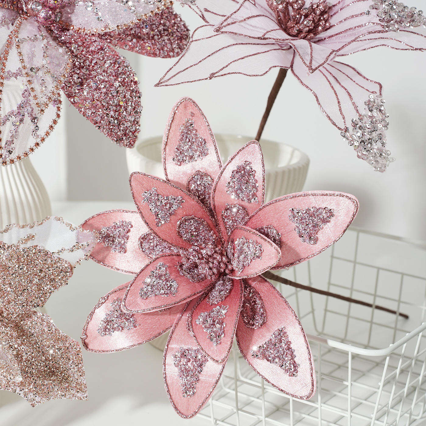
Decorating a Christmas tree is one of the most beloved holiday traditions, but it can quickly become overwhelming when you're standing in front of a cart full of baubles, ribbons, and lights wondering which combination will actually look good together. The secret to a truly stunning tree isn't buying more — it's being intentional about color. Knowing how many colors to limit yourself to when selecting Christmas tree decoration ornaments makes the difference between a tree that looks curated and one that looks chaotic.
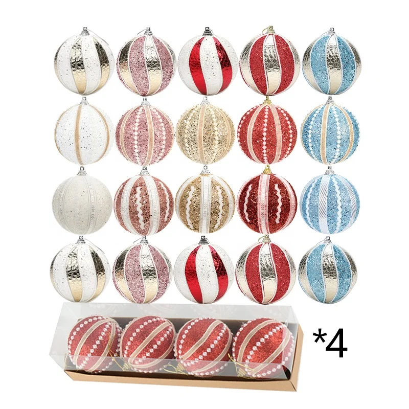
The answer most interior stylists and professional decorators agree on is simple: limit your Christmas tree decoration ornaments to two to four coordinating colors for a cohesive, visually balanced result. This doesn't mean your tree has to be boring or monotone. It means every element you add should feel like it belongs to the same visual family, creating harmony that's immediately pleasing to the eye. In this guide, we'll walk through the reasoning behind this rule, how to apply it effectively, and how to make your color-limited tree look more impressive than one decorated with every shade in the spectrum.
The Visual Logic Behind Limiting Your Color Palette
Why Too Many Colors Create Visual Noise
The human eye naturally seeks pattern and order. When a Christmas tree is decorated with too many competing colors, the brain struggles to find a focal point and the result feels busy rather than beautiful. Christmas tree decoration ornaments in five, six, or seven different hues pull attention in every direction at once, making the overall design feel unintentional and restless. Cohesion comes from repetition, and repetition is only possible when you've committed to a limited range of tones.
Think of a Christmas tree the way a professional designer thinks of a room interior. A well-styled room typically uses a dominant color, a secondary color, and one or two accent tones. The same logic applies to holiday decoration. When your Christmas tree decoration ornaments follow a clear color hierarchy, the eye travels naturally around the tree and lands on points of emphasis rather than getting lost in a sea of competing shades.
This is especially important for trees that will be photographed or displayed in retail or hospitality settings, where visual impact needs to register instantly. A tightly controlled palette communicates sophistication and deliberate styling, which is why professional window displays and hotel lobbies almost always follow the two-to-four color rule when selecting Christmas tree decoration ornaments.
How Color Quantity Affects Perceived Tree Size and Shape
An often-overlooked consequence of color overload is that it can visually flatten or distort the shape of the tree. When Christmas tree decoration ornaments are placed without a color strategy, the lights and ornaments blur together and the classic triangular silhouette — which is part of what makes a decorated tree so iconic — becomes harder to perceive. A limited palette actually enhances the three-dimensional quality of the tree by creating depth through tone contrast within a harmonious range.
For example, pairing deep jewel tones with metallic accents in the same color family creates a sense of volume and layering that makes the tree appear fuller and more structured. Using a dominant warm color like burgundy or gold, then adding a secondary cool accent like champagne or ivory among your Christmas tree decoration ornaments, gives the tree depth without introducing conflicting visual signals. The tree looks larger, lusher, and more professionally arranged as a direct result of color discipline.
Choosing the Right Two to Four Colors for Your Tree
Starting with a Dominant Color Anchor
Every cohesive tree starts with one dominant color that will appear most frequently across your Christmas tree decoration ornaments, ribbon, and tree skirt. This anchor color sets the emotional tone of the entire display — red signals warmth and tradition, navy conveys elegance and modernity, blush pink creates a romantic or whimsical feel, and deep green reinforces a natural, forest-inspired aesthetic. Choose this color based on both personal preference and the room environment where the tree will live.
Your dominant color should account for roughly 50 to 60 percent of your visible Christmas tree decoration ornaments. This ensures that when someone looks at your tree, the first impression is a single strong color story rather than confusion. From there, you build upward with complementary tones that support and enhance the dominant anchor without competing with it.
It's also worth considering whether you want a warm or cool dominant tone, because this decision will guide every other color choice. Warm dominants like gold, red, and copper pair beautifully with creams, burnt oranges, and deep plums. Cool dominants like silver, white, and icy blue pair well with pale metallics, soft greys, and clear crystal tones in Christmas tree decoration ornaments.
Adding Secondary and Accent Colors Strategically
Once your dominant color is established, add one secondary color that complements it without competing. This secondary tone typically appears in about 30 percent of your Christmas tree decoration ornaments and in structural decorative elements like ribbon or garland. The relationship between your dominant and secondary colors is the heart of your palette, and it should feel intentional — either analogous (neighboring on the color wheel) or complementary (opposite on the color wheel for contrast).
Your accent color or colors — used sparingly, in no more than 10 to 20 percent of Christmas tree decoration ornaments — serve as visual punctuation. They draw the eye to specific areas of the tree and add interest without disrupting the overall harmony. Metallic finishes like gold, silver, or rose gold work especially well as accents because they catch light and add dimension while technically functioning as neutral tones that blend with almost any palette.
Be cautious about introducing a third fully saturated color as an accent. This is where many decorators accidentally cross the line from curated to cluttered. If your dominant color is forest green and your secondary is champagne gold, a strong red accent can work beautifully — but adding a bright blue or vivid purple alongside it will immediately undermine the cohesion you've worked to establish in the rest of your Christmas tree decoration ornaments.
Practical Rules for Maintaining Color Discipline During Decorating
Editing Your Ornament Collection Before You Begin
One of the most effective practices professional decorators use is editing their ornament collection before placing a single item on the tree. Lay all of your Christmas tree decoration ornaments out on a flat surface and physically sort them by color. Remove any that fall outside your chosen two-to-four color palette entirely — even if they're sentimental or expensive. Either store them for a different tree or use them in alternative decorating contexts like table centerpieces or wreaths.
This pre-edit step is psychologically difficult but visually essential. It forces commitment to the palette and prevents the gradual palette creep that happens when decorators add ornaments piece by piece without seeing the full collection together. When all of your Christmas tree decoration ornaments are spread out in front of you, it becomes immediately clear which items support your color story and which ones work against it.
The editing process also reveals gaps in your collection. If you find that your dominant color has plenty of ornament representation but your secondary color is sparse, you know exactly what to purchase. This targeted approach to shopping for Christmas tree decoration ornaments saves money and prevents the accumulation of mismatched pieces that contribute to the very color chaos you're trying to avoid.
Distributing Colors Evenly Around the Tree
Once your palette is confirmed and your Christmas tree decoration ornaments are edited, color placement becomes the critical next step. The goal is even distribution — not clustering all of one color in one section of the tree. Clustering creates visible imbalance and makes the tree look like it was decorated in stages by different people with different plans. Even distribution creates the sense of a unified, intentional design.
A practical method is to divide the tree into quadrants and ensure each quadrant contains roughly the same proportions of dominant, secondary, and accent Christmas tree decoration ornaments. Step back frequently while decorating to assess the balance from a distance, since ornament placement tends to look very different up close versus from across the room where most viewers will experience it.
Vary the sizes and finishes of your Christmas tree decoration ornaments within your palette as well. A mix of matte and glossy finishes, or large statement balls paired with smaller fillers in the same color, adds textural richness without introducing new colors. This technique allows you to stay within your four-color maximum while still achieving the layered, luxurious look associated with professionally decorated trees.
How Multi-Color Ornaments Fit Into a Cohesive Palette
Using Multi-Color Ornaments Without Breaking Palette Rules
Multi-color Christmas tree decoration ornaments can absolutely be used in a cohesive palette strategy — the key is selecting multi-color pieces where every color present is already part of your established palette. For example, if your palette is red, gold, and cream, a multi-color ornament that blends red with gold thread or gold with cream detailing fits perfectly within the palette without introducing a disruptive new tone.
The problem arises when multi-color Christmas tree decoration ornaments are treated as wild cards — as if the fact that they contain multiple hues exempts them from the palette discipline applied to solid-color pieces. A single ornament that includes red, green, blue, yellow, and purple will fracture a carefully limited palette the moment it's placed on the tree. The colors in each individual ornament must be evaluated against the overall scheme, not judged in isolation.
Thread-wrapped foam Christmas tree decoration ornaments with carefully selected multi-color combinations are an excellent way to achieve pattern and texture interest while respecting palette boundaries. The dimensional surface of these ornaments catches light beautifully and adds visual complexity that makes the tree feel rich and layered — all while staying within the two-to-four color framework that defines cohesive holiday decorating.
When Breaking the Rule Makes Sense
There are legitimate creative contexts where expanding beyond four colors can work — most notably in intentionally eclectic or maximalist tree designs, or in children's bedroom trees where the goal is joyful abundance rather than refined elegance. In these cases, the rule isn't being broken so much as replaced with a different design logic: randomness as a deliberate aesthetic, or emotional warmth over visual sophistication.
Even in maximalist approaches, experienced decorators often anchor the eclectic mix with a consistent metallic thread — usually gold or silver Christmas tree decoration ornaments woven throughout — that provides just enough visual continuity to keep the tree from looking completely disordered. The metallic acts as a unifying element that ties together otherwise disparate hues, functioning as a secret palette anchor even when the official color count is high.
The important takeaway is that cohesion is always a goal, even when the method for achieving it varies. Whether you're working with a strict two-color minimalist palette or an intentionally abundant multi-color mix, your Christmas tree decoration ornaments should always feel like they belong to the same tree — selected with intention rather than accumulated without thought.
FAQ
Is it possible to achieve a cohesive look with four colors, or is two always better?
Four colors can absolutely produce a cohesive result as long as there is a clear hierarchy — one dominant, one secondary, and two accents used sparingly. When all four colors share a common undertone (all warm or all cool), they naturally feel harmonious. Christmas tree decoration ornaments in four well-chosen tones often look richer and more layered than a strict two-color scheme without sacrificing visual order.
How do I handle sentimental ornaments that don't fit my chosen palette?
Sentimental Christmas tree decoration ornaments that fall outside your palette can be grouped together on a small dedicated tabletop tree or holiday vignette rather than placed on your main display tree. This approach honors their emotional significance while protecting the visual integrity of your curated color scheme on the primary tree.
Do lights count as part of the color palette when planning ornament colors?
Yes — lights absolutely factor into your palette. Warm white or yellow-toned lights enhance warm-palette Christmas tree decoration ornaments like gold, red, and copper, while cool white lights complement silver, blue, and icy tones. Mixing warm and cool lights with opposing palette ornaments creates an underlying tension that undermines cohesion even when the ornaments themselves are well-matched.
Can I mix different finishes — matte, glossy, and glitter — within the same color palette?
Mixing finishes is highly recommended and adds the kind of textural depth that makes a tree look professionally styled. As long as the underlying color of each finish stays within your chosen palette, combining matte, glossy, and glitter Christmas tree decoration ornaments creates visual interest without introducing new competing colors. This technique is one of the most effective ways to make a limited palette feel luxurious rather than restricted.
Table of Contents
- The Visual Logic Behind Limiting Your Color Palette
- Choosing the Right Two to Four Colors for Your Tree
- Practical Rules for Maintaining Color Discipline During Decorating
- How Multi-Color Ornaments Fit Into a Cohesive Palette
-
FAQ
- Is it possible to achieve a cohesive look with four colors, or is two always better?
- How do I handle sentimental ornaments that don't fit my chosen palette?
- Do lights count as part of the color palette when planning ornament colors?
- Can I mix different finishes — matte, glossy, and glitter — within the same color palette?